Lab 11: Interactions With Categorical Predictors
PSYC 7804 - Regression with Lab
Visualizing write ~ gender
Once again, we can visualize the mean differences between the two groups.
This is nothing new, but it is interesting to see what happens to this plot once we add a continuous predictor to our regression.
Plot code
mean_female <- mean(hsb2$write[hsb2$gender == "female"])
mean_male <- mean(hsb2$write[hsb2$gender == "male"])

ggplot(hsb2, aes(x = gender, y = write)) +
  geom_point() +
  geom_hline(aes(yintercept = mean(mean_female), color = "Female"),
             linetype = "dashed") +
  geom_hline(aes(yintercept = mean(mean_male), color = "Male"),
             linetype = "dashed") +
  scale_color_manual(values = c("Female" = "blue", "Male" = "red")) +
  labs(color = "Means")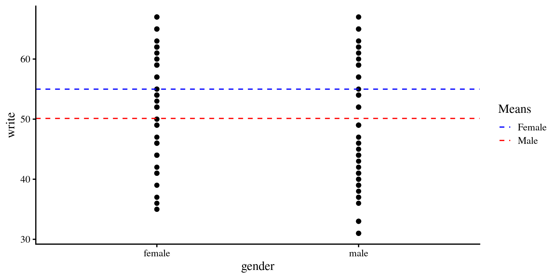
Visualizing write ~ gender + socst
What this model represents is effectively two separate regression lines for the two groups, which differ only based on the intercept.
If you have heard of the term ANCOVA before, this is what we just ran.
Note that the slopes are the same, meaning that we are assuming that the relation between
socst and write should be the same for both groups.
Plot code
ggplot(hsb2, aes(x = socst_cent, y = write, colour = gender)) +
  geom_point(aes(shape = gender), alpha= .6) +
  geom_abline(intercept = coef(reg_both)[1], slope = coef(reg_both)[3], col = "purple") +
  geom_abline(intercept = coef(reg_both)[1] + coef(reg_both)[2], slope = coef(reg_both)[3], col = "red") +
scale_color_manual(values=c( "purple", "red")) 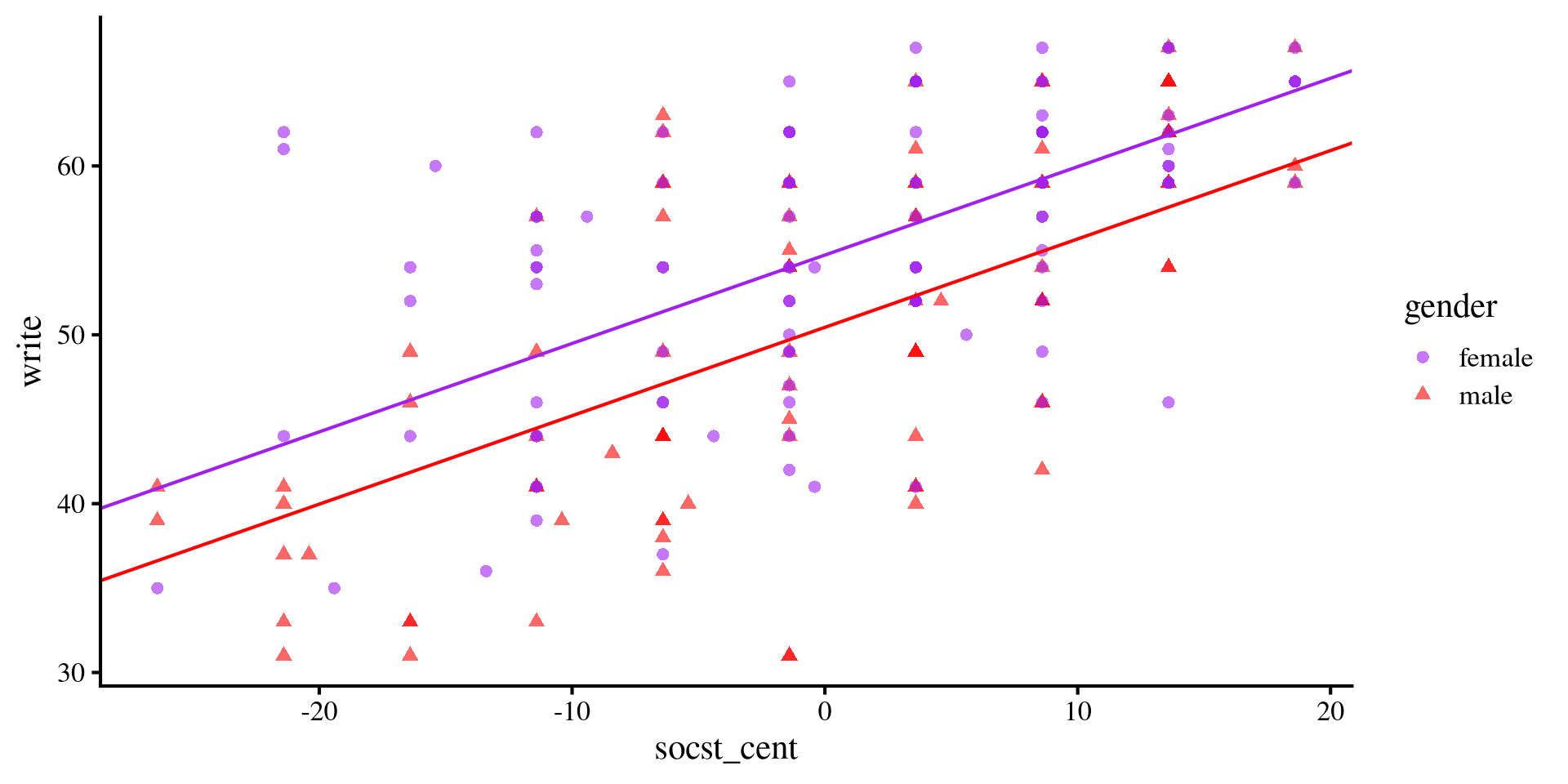
Visualizing write ~ gender * socst
The slope for
males is steeper. Although at lower levels of socst, females do considerably better, the gap closes more and more as socst increases.
A significant interaction term implies that the difference between the slopes between the two groups is non-zero.
Plot code
ggplot(hsb2, aes(x = socst_cent, y = write, colour = gender)) +
  geom_point(aes(shape = gender), alpha= .6) +
  geom_abline(intercept = coef(reg_int)[1], slope = coef(reg_int)[3], col = "purple") +
  geom_abline(intercept = coef(reg_int)[1] + coef(reg_int)[2], slope = coef(reg_int)[3] + coef(reg_int)[4], col = "red") +
scale_color_manual(values=c( "purple", "red")) 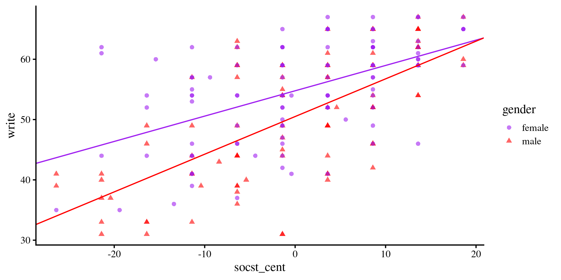
Plot code
ggplot(hsb2, aes(x = socst_cent, y = write, colour = gender)) +
  geom_point(aes(shape = gender), alpha= .6) +
  geom_abline(intercept = coef(reg_both)[1], slope = coef(reg_both)[3], col = "purple") +
  geom_abline(intercept = coef(reg_both)[1] + coef(reg_both)[2], slope = coef(reg_both)[3], col = "red") +
scale_color_manual(values=c( "purple", "red")) 
Plot code
mean_female <- mean(hsb2$write[hsb2$gender == "female"])
mean_male <- mean(hsb2$write[hsb2$gender == "male"])

ggplot(hsb2, aes(x = gender, y = write)) +
  geom_point() +
  geom_hline(aes(yintercept = mean(mean_female), color = "Female"),
             linetype = "dashed") +
  geom_hline(aes(yintercept = mean(mean_male), color = "Male"),
             linetype = "dashed") +
  scale_color_manual(values = c("Female" = "blue", "Male" = "red")) +
  labs(color = "Means")
Predicted Means Graphically
The previous slide may seem intimidating, but the means of write score that we just calculated (brown dots in the plot) are simply the values of \(y\)-axis given some values of \(x\) according to the regression line of each groups.
 socst_cent gender emmean    SE  df lower.CL upper.CL
      -10.7 female   50.3 1.030 196     48.2     52.3
        0.0 female   54.8 0.692 196     53.4     56.1
       10.7 female   59.3 0.979 196     57.4     61.2
      -10.7 male     43.8 1.020 196     41.8     45.8
        0.0 male     50.5 0.757 196     49.0     52.0
       10.7 male     57.2 1.070 196     55.1     59.3

Confidence level used: 0.95 Plot code
ggplot(hsb2, aes(x = socst_cent, y = write, colour = gender)) +
  geom_point(aes(shape = gender), alpha= .6) +
  geom_abline(intercept = coef(reg_int)[1], slope = coef(reg_int)[3], col = "purple") +
  geom_abline(intercept = coef(reg_int)[1] + coef(reg_int)[2], slope = coef(reg_int)[3] + coef(reg_int)[4], col = "red") +
  scale_color_manual(values=c( "purple", "red")) +
  geom_point(aes(x = -10.7, y = 50.3), color = "brown", size = 4) +
  geom_point(aes(x = -10.7, y =  43.8), color = "brown", size = 4) +
  geom_point(aes(x = 0, y = 54.8), color = "brown", size = 4) +
  geom_point(aes(x = 0, y =  50.5), color = "brown", size = 4) +
  geom_point(aes(x = 10.7, y = 59.3), color = "brown", size = 4) +
geom_point(aes(x = 10.7, y = 57.2), color = "brown", size = 4) 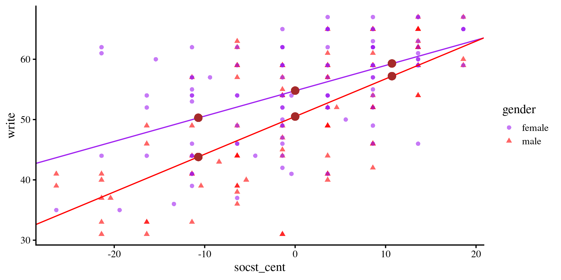
Mean differences Graphically
Testing mean differences at different values of
socst simply mean testing whether the dashed black lines are significantly different from 0 in length. The dashed lines, representing the distance between the two regression lines becomes smaller and smaller as socst increases.
It’s a matter of perspective
You may have noticed that first we looked at (1) whether the slope of socst changed depending on gender, and then we (2) looked at whether there were mean differences in mean write score for gender depending on different values of socst. In other words, we swapped the variable that we were treating as the moderator. This highlights how from a statistical perspective there is no difference between a moderator and a focal predictor. You decide how two present the results and frame the two variables.
Plot code
# save summary for mean differences
sum <- summary(means)

ggplot(hsb2, aes(x = socst_cent, y = write, colour = gender)) +
  geom_point(aes(shape = gender), alpha= .2) +
  geom_abline(intercept = coef(reg_int)[1], slope = coef(reg_int)[3], col = "purple") +
  geom_abline(intercept = coef(reg_int)[1] + coef(reg_int)[2], slope = coef(reg_int)[3] + coef(reg_int)[4], col = "red") +
  scale_color_manual(values=c( "purple", "red")) +
  geom_segment(y = sum[1,3], yend = sum[4,3], x = sum[4,1], xend = sum[4,1], col = "black", lty = 2) +
  geom_segment(y = sum[2,3], yend = sum[5,3], x = sum[5,1], xend = sum[5,1], col = "black", lty = 2) +
geom_segment(y = sum[6,3], yend = sum[3,3], x = sum[3,1], xend = sum[3,1], col = "black", lty = 2) 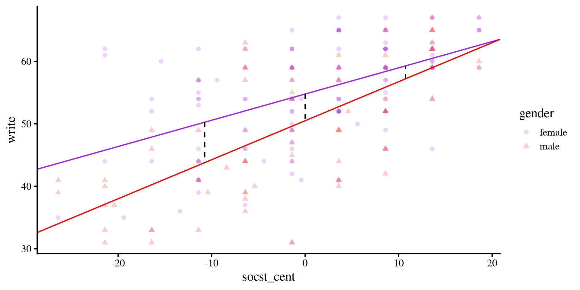
johnson-neyman Plot?
Instead of testing differences in the slopes for the 2 groups at different values of the continuous variable, we can do that for all possible values of the continuous variable by using a Johnson-Neyman plot
# the predictor must be a vector of 0s and 1s
hsb2$gender_bin <- ifelse( hsb2$gender == "female", 0, 1)

# rerun the regression with binary gender
reg_int_2 <- lm(write ~ gender_bin * socst_cent, data = hsb2)

# save summary for mean differences
interactions::johnson_neyman(reg_int_2,
              pred = "gender_bin",
              modx = "socst_cent")
Because we have a categorical variable, the interpretation is conceptually different than what we saw in Lab 9
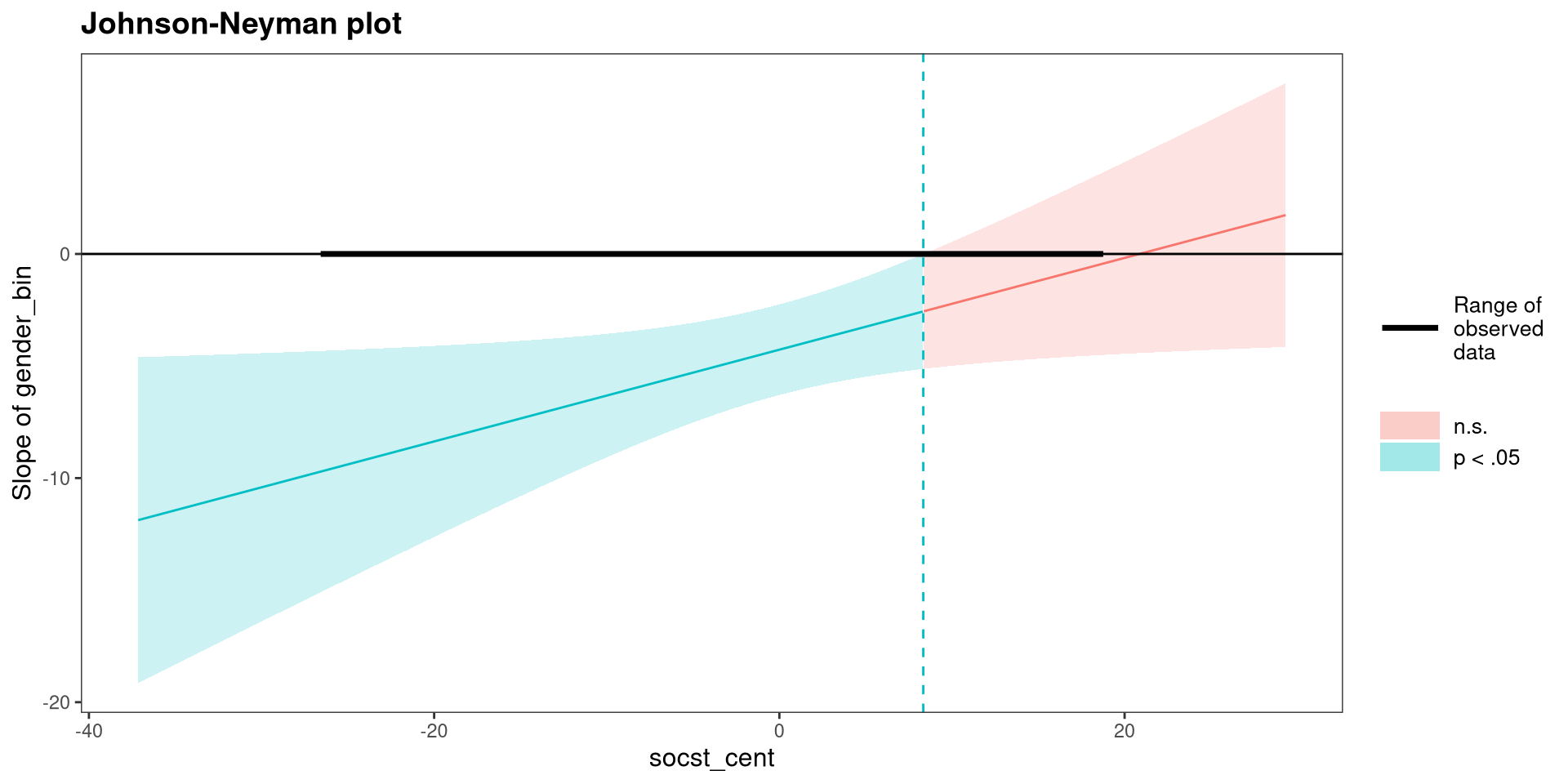
The \(y\)-axis is the difference between the two group means (i.e., the distance between the two lines on the previous slide) in
write score for each value of socst score. Consistent with the plot on the previous slide, the difference is no longer significant when socst is around 10 or more.
Plotting with emmip()
We can use the emmip() to plot the slopes for both groups.
First, we need to create a list that tells
emmip() the range of the continuous variable for which want to plot slopes. here I choose the minimum and maximum of socst_cent.
min <- min(hsb2$socst_cent)
max <- max(hsb2$socst_cent)

mylist <- list(socst_cent = c(min,
                              max))
Then we pass pass the regression object, the categorical variable by which we want the slopes, and the list containing the range of the x-axis.
emmip(reg_int, gender~socst_cent, at = mylist)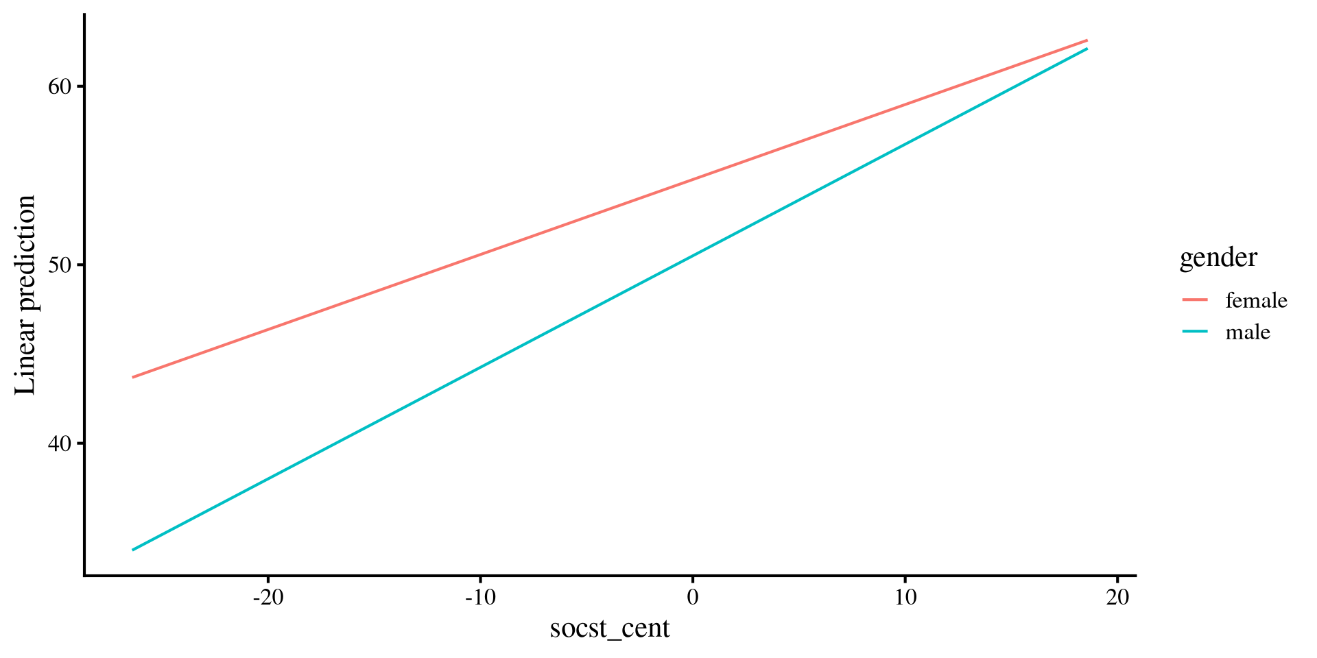
This may seem a bit complicated for no reason 🤨 but it affords lots of flexibility when your model is more complex than what we have here.
I personally prefer plotting things “manually” with
ggplot 🫣, although I understand that may not be everyone’s cup of tea
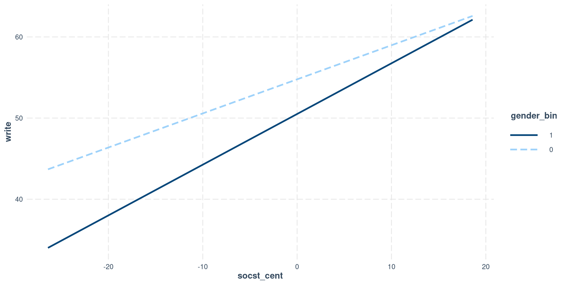
Plotting with interact_plot()
In our case, it is slightly simpler to use the interact_plot() function, but, unlike emmip(), it requires a binary variable and only works with 2 categories.
interactions::interact_plot(reg_int_2,
              modx = "gender_bin",
              pred = "socst_cent",
              modx.values = c(0, 1))
Notice that I am using the regression model with the binary version of gender because the interactions package does not play nice factor variables.
So, you have multiple options for plotting simple slopes. Still, my go to is just using ggplot because it gives me the most freedom (as you can tell from earlier slides).